02 Feb Prince’s New Album Cover Revealed
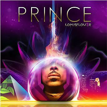
Lotus Flow3r
Rolling Stone has revealed the artwork for Prince’s new album Lotus Flow3r in an article about Prince’s recent late night soiree at his Beverly Hills mansion. You may recall we brought you here the first recap of the night’s events.
So what do you think? Pretty? y/n? It looks very Earth,Wind, & Fire/Jacksons, doesn’t it? Can’t wait to hear what’s inside. – Dr. FC
2allspice
Posted at 23:53h, 12 January1speculator
axiolabs suppliers
Posted at 05:42h, 04 April… [Trackback]
[…] Find More Informations here: drfunkenberry.com/2009/02/02/princes-new-album-cover-revealed/ […]
squidproxies Proxies
Posted at 12:52h, 13 FebruaryYoure so cool! I dont suppose Ive read anything like this before. So nice to obtain somebody with some original thoughts on this subject. realy thank you for beginning this up. this web page is something which is required on the internet, someone using a little originality. beneficial job for bringing some thing new to the net!
Versace sunglasses
Posted at 11:33h, 03 March…
Valuable information and fantabulous figure you got here! I would like to. thank you for sharing your ideas and about time into the stuff you post ! ! . Thumbs up! ….
milly
Posted at 23:15h, 10 Julyhis album cover does have meaning and yes its very spiritual but with what spirit.i do know that the spirit is a spirit channeled through a spirit they call the old one. now i am a bit confused about his eyes covered usually the eyes are focused upon.the triangle is caped and the all seeing eye is gone but the leaves represent life………..does anyone see where i am going with this if so please respond
FUNKADELIC
Posted at 10:03h, 20 FebruaryI could write quite a few pages analizing this album art useing my media studies knowleage. There is a big debate on whether it’s a. L.A or Minni skyline, I belive it’s a Minni skyline looking at pictures of both. The blue light comming from the lotus flower is from L.A though, I think he is trying to combine the two. I love the album art, purple and gold together is def a signature of Prince. One of the best!
Carlos
Posted at 01:11h, 18 FebruaryI am a Prince fan from way back. I’m not fareweather. I have been very critical of Prince lately because his music is not only not up to par with the things he’s released in the past, but it has flat out sucked. I dig the album cover, but I hope that the music matches what we see on the cover.
Kev1999
Posted at 22:12h, 17 Februarywatson it’s like Stevie
Watson, its like Stevie Wonder, if i could come back as a flower…
xemplify
Posted at 15:12h, 14 Februarywell all i will say is i hope the music is better than the artwork 😉
iceblueangel
Posted at 15:09h, 11 FebruaryI “LOVE” it. I can’t wait to be part of the old & new family, with the new name. LotusFlow3r 😀
Ria
Posted at 08:58h, 10 FebruaryIt does resemble the EWF All N All album (which I still have), and the JAckson 5’s album. It’s a pretty clever cover…very colorful. Heard a few tracks…Old Prince coming through – little bit of Jimi Hendrix in there. I like it.
Pamela CrazyP Harris
Posted at 12:55h, 08 FebruaryPRINCE rep is at steak he is known not only for his Music But 4 His visions of expresions as well – he expscts nothing less of himself – thank GOD
A Graphic Designer
Posted at 03:21h, 07 FebruaryLess is more. K.I.S.S.
Typography is important. Free fonts does not equal great fonts.
Prince stood or perhaps sat behind the “designers” and directed them. A graphic designer not only designs but advises, gives valid points as to why say just showing a mouth makes no sense. Why a Halloween free font does not work. Why PRINCE is too big and have the guts to walk away if the client thinks just because its his music work, that he/she should leave the visuals to the professionals. They are not your puppets.
Rudy M Alapag Jr
Posted at 19:24h, 06 Februaryit’s a funky purple prince cover for the new year, the new JAM cover
of the year!We should never let down DA MAN “PRINCE”.
he’s the purple guy, and we’re seeing a whole new different look of the CD cover, which we don’t see Prince’s face, well, some of it, but the thing is it looks like this the 2nd time he didn’t show his face since Rainbow Children.
Oh, also The Black Album. I should never neglect Prince’s art of the CD.
Purple Reigns, everyone!!!
acey
Posted at 18:00h, 06 FebruaryIt really makes you wonder about these people all around the world, who seem to take joy in putting down everything Prince does. There are some Prince sites where some of the fams, do nothing but criticize Prince’s music and everything else he does. It really makes you wonder it these people are true Prince fams. And the sad thing about it is, that most of the people don’t have half the talent that Prince has. Those of us who are real die hard fams love everything that he does.
KAMALEZAT
Posted at 04:38h, 06 FebruaryHI
Annastesia Nevermind
Posted at 14:23h, 04 FebruaryHey Prince —
I liked your cover of Radiohead’s song Creep that you did at the Caochella Festival. Great vocals.
J Smooth
Posted at 10:42h, 04 FebruaryCan you say:
Site influence:
Janelle Monáe
Album influence:
Lotus live Sanata?
great looking site and excited for the return of the axe.
Hopefully he will have Rock station support?
Good luck with that!
AnnaMpls
Posted at 20:43h, 03 FebruaryHis eyes are not shown because he does not need them to C.
I Wish Him Heaven!
JC
Posted at 17:17h, 03 FebruaryLooks GREAT! Beautiful Colors and Tones, Nice Image and Layout.
Can hardly wait for the new album!
Jochem3121
Posted at 13:25h, 03 FebruaryI agree with you JJ, that’s what I said! 🙂
Still cool though! Waiting long enough, come on.. gimme the music!
Purple Funk Lover
Posted at 13:15h, 03 FebruaryI feel the cover shot is very creative. I see some of you all don’t like it. Do you think you can do better? Perhaps you can, but it’s not your vision of the music. I don’t except what Prince puts out. I admire his genius and I enjoy his art.
Shut Up … Already, Damn !!!
LexAve456
Posted at 12:23h, 03 FebruaryThat’s a fly cover! Very artistic and he hasn’t had one like that in a while. I can’t wait for Lotusflow3r to drop!
JJ
Posted at 11:52h, 03 FebruaryI think it’s a nice concept… but i wish it was a little more “REAL” rather than so clean and crisp. The music is guitar laden and i think a more SIMPLISTIC and NATURAL concept would have worked better… I’d expect the cover for MPLSsound to look like this maybe, not Lotus Flow3r. Oh well…
… and yup the font is awful. Plain awful.
Carlita
Posted at 10:20h, 03 FebruaryHmm, Behold the Jewel in the Lotus. I like it. Om Mani Padme Hum.